This is the third post to our series investigating PPS measurements in Amazon EC2. Here are the other posts in the series:
- How many packets per second in Amazon EC2? (introduction)
- EC2 packets per second: guaranteed throughput vs best effort
- Packets per second in EC2 vs Amazon’s published network performance (this post)
- Payload size doesn’t affect max PPS limit on AWS
- PPS spike every 110 seconds on EC2
- Using t1/t2/t3 unlimited to increase packet limitations
To get the network performance categorizations, I used ec2instances.info. If you use AWS and you’re not familiar with this open-source project, definitely check it out. It’s good for comparing instance types, resources, and prices in a spreadsheet.
As in prior posts, the raw data is still available in the Github repo. Additionally, all the calculations, graphs, and summary data can be found in this Google Spreadsheet.
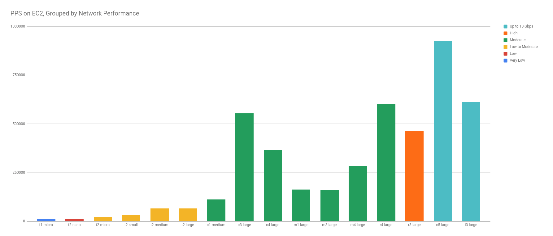
PPS has a Weak, Positive Correlation to Network Performance
In the graphs below, there is a very weak, positive correlation between network performance and PPS — as network performance increases, so does the average PPS limit. But the correlation is weak — though we can see a trending pattern, there are enough outliers to suggest that more data points may disprove it.
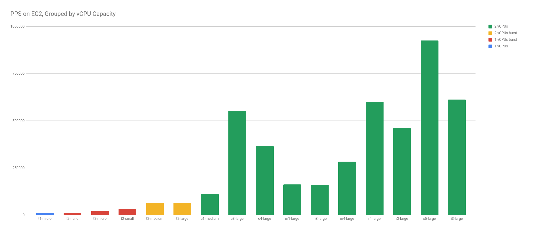
I also compared vCPU capacity to PPS. Because the CPU was maxed out on t1/t2/t3 instances, I thought the PPS may have been limited to CPU and given a funny correlation. Here again, there is a very weak, positive correlation between vCPU capacity and PPS — as vCPU capacity increases, so does the average PPS limit.
Remember, we’re looking for an AWS-instituted packets-per-second limit in this test. As the size of your average packet increases, the PPS will drop, which is not accounted for in any of our numbers or testing.
Step Function vs Exponential Graph
The positive correlation in both the vCPU capacity and the published Network Performance designations wasn’t a shocker to me. However, the weak correlation really threw me for a loop. I was expecting a well-defined step function between different designations, like this:
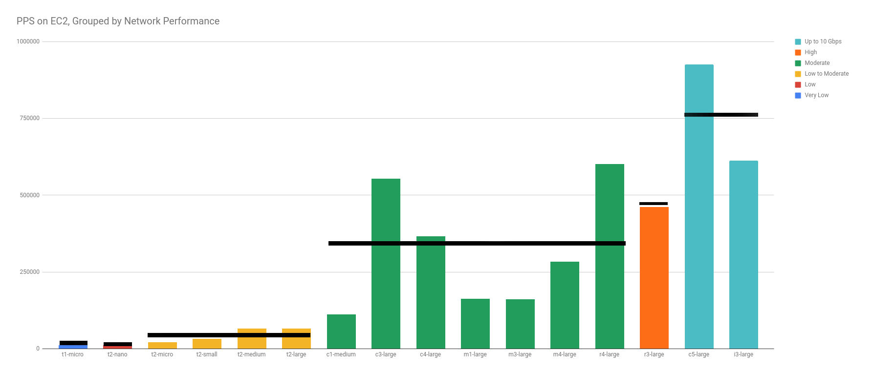
Instead, what I found, was a wide variation in each designation. It becomes obvious when you ignore the categories with only 1 data point (Very Low, Low, High).
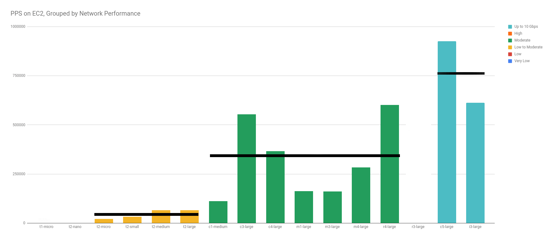
With more data points, I have no doubt that the excluded categories would have been just as scattered.
Sure, I could have made the graph look more like a hockey-stick by ordering the columns in a different way. An argument could be made that it would show stronger correlation. This argument misses the identical categorization AWS specifies for network performance among the groups.
Actual Bandwidth Limitations
After seeing the weak correlation, I went on the prowl for data on the actual bandwidth limitations, to compare them against our measurements on packets. Maybe the outcome would be more predictable or expected?
Andreas Wittig did a similar test on bandwidth and reported limits for most instance types. He published his findings in his EC2 Network Performance Cheat Sheet. Thanks Andreas! There were a couple, older generation, types we tested that weren’t represented in their findings.
When you graph the bandwidth limitations found by Andreas against Amazon’s published “Network Performance” categories, the result adds more confusion than color to our already weak correlation. So, to avoid more confusion than necessary, this next graph has all the same instances, in the same order, colored the same way, but notice that there is even less correlation than before.
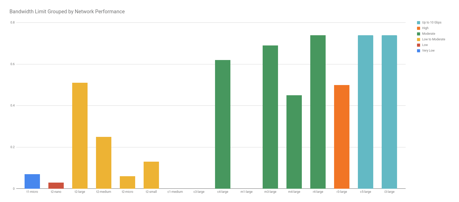
I first notice that t2.large has more bandwidth than an m4.large, even though “Low to Moderate” should be less than “Moderate”. Similarly, r4.large has more bandwidth than r3.large, even though “Moderate” should be less than “High”. In fact, r4.large has as much as the 10 Gbps c5.large and i3.large!
Conclusion
After studying the graphs and raw data, I’ve narrowed down conclusions to three possibilities:
- There is some other factor hiding a better correlation. Originally, I thought CPU might be the key, but that fell out quickly as shown in the graphs above. It’s within the realm of reason that better code, different zones, more data points, or burning incense in the right temple makes this look more like a step function.
- AWS is incredibly loose in their network performance categorizations. Seems pretty obvious now, but it wasn’t before. Both the PPS and bandwidth limits have too much variability in the same categories, and not enough variability between categories to suggest any strong correlation.
- AWS doesn’t measure packets per second in network performance. I stated this possible cause from the beginning. Yet, It stands to reason that an increase in NIC capacity, would result in a near-identical increase in PPS capability.
My intent in writing this was to narrow down what the root cause for the poor correlation. In all honesty, I think the answer lies somewhere in the middle, each one playing a significant factor to the unpredictability of Amazon’s published Network Performance groups. They probably knew this, and that’s why they say “High” instead of “0.82 Gb/s”.
If anything, this should encourage you to rely on testing your own limits, watching your own scaling factors, and staying on top of your infrastructure, because you can’t rely on AWS to do it for you.